
← All work
Furyo Cafe
Strategy, identity and interior design in one project. Furyo opened already being the brand, not a room with a logo stuck on it.
Client
Furyo Cafe
Place
Ensenada, Baja California
Scope
Strategy, Identity, Interior Design
YEAR
2026
The brief
They wanted a café. What was missing was a reason to cross the street for coffee.
Ensenada has good coffee on every block. Competing on beans or price was a losing fight; the open ground was the experience — how you come in, where you sit, how close you are to the bar, who you end up talking to. So the brand and the space were designed at the same time, in the same file: every identity decision had to be buildable, and every build decision had to be sayable.

The process
01
Strategy
Workshops with the owners, a map of the local competition, and one full afternoon counting who walks down that street and when. Out of it came the idea that ordered everything else: a coffee room, not a café — a room you stay in, not a counter you collect from. That set the name, the tone and, above all, how many seats there could be.
02
Branding
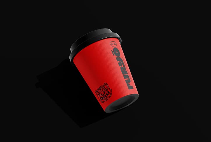
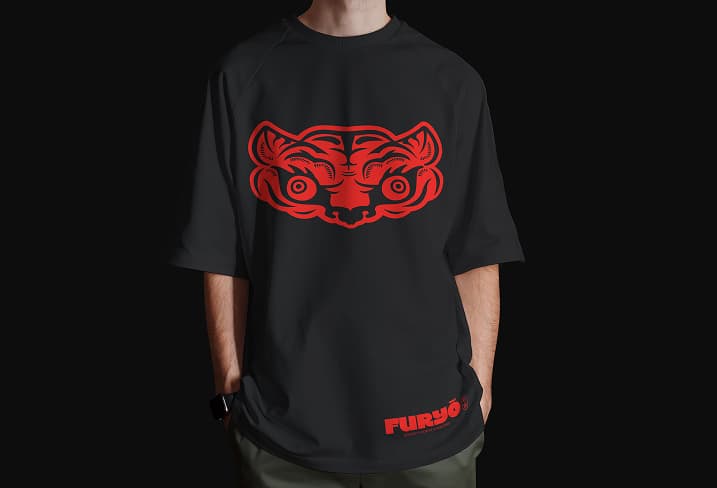
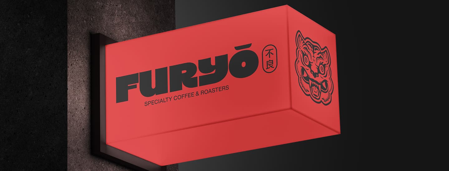
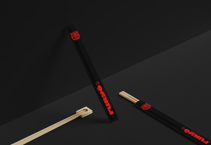
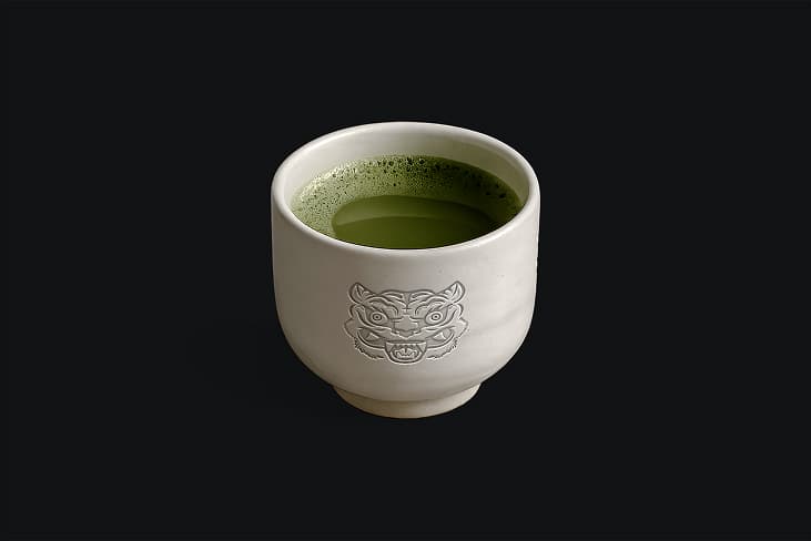
Furyo’s branding draws upon the free, expressive spirit of Japanese youth subcultures and the aesthetic of *sukajan* jackets, fusing them with elements from Ensenada to create a bold, sensory, and welcoming identity that celebrates creativity and the freedom to break away from the conventional.
03
Interior Design
The space follows the idea from strategy: a place to stay, not a counter to pass through. A curved steel bar wrapped in red tile sits at the center, so the coffee and the roaster are part of the show and every seat has a view of the bar. Warm wood, a backlit timber ceiling, paper lanterns and deep red walls bring the sukajan-inspired identity into the space, turning the brand into something you can sit inside.

The outcome
A brand that doesn't need explaining: people understand what Furyo is within five seconds of walking in.
It's the project we show when someone asks what 360 means in practice. When one team carries all three stages, nothing gets lost in translation — what's decided in strategy arrives intact at the furniture, the menu and the sign.
Work with us
Tell us about your next project.
hello@kult.mx →
STUDIO
Mexico
New York
PHONE
(MX) +52 646 440 0024
(US) +1 646 975 0201
SOCIAL
@studiokultmx
© 2026 K’ult Studio
All rights reserved